 This chapter introduces the basics of color theory, choosing color schemes that work, and good practice when dealing with color on the Web.
This sample is taken from Chapter 2: "Colors" of the Glasshaus Title "Web Graphics for Non-Designers"
This chapter introduces the basics of color theory, choosing color schemes that work, and good practice when dealing with color on the Web.
This sample is taken from Chapter 2: "Colors" of the Glasshaus Title "Web Graphics for Non-Designers"
![]()
![]()
![]()
![]()
![]()
![]()
![]()
![]()
![]()
Consistency is key to good color practice on the Web, reinforcing brand recognition and familiarity. Steady usage of color makes users feel at home, and eases the ability of a visitor to recognize when they have shifted outside the realm of your site. Other sites may have different standards with regard to security, member privacy, sales policies, and quality of product. It is important that you make it as easy as possible for users to recognize their movement outside your zone of control.
With an increase in the strength of a brand and its color association, the importance of color consistency also increases.
You will be familiar with the following examples of strong color association and uniformity:
| |
|
| Screenshot: amazon.com |
Screenshot: ibm.com |
There are some methods that you can employ which will simplify the process of standardizing your colors.
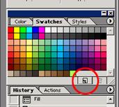
| While designing your site templates, specifying key colors and using these as a source for others is as simple as clicking the new swatch icon on your color palette in Photoshop when you have the desired color as your foreground selection. Photoshop also has the ability to save custom palettes, allowing you to maintain a single source file, and thus consistency. These preferences can be found within the layer options. Other graphics packages have similar features. |
|
| |
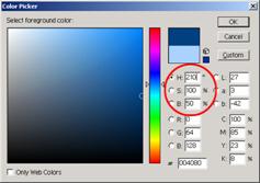
While still in your preferred layout application, selecting shades and tints from your core hues keeps you from moving even slightly out of the range of your scheme. In the screenshot to the left, you will note that while selecting a color from those available, the hue value (H) does not change. You can still change the saturation of the color by altering the percentage of S, or the brightness (B). |
When your site moves further into production, comments in stylesheets are an excellent way of maintaining your custom palette. Awareness among your production team is also a good idea, guaranteeing that no one will ever source a color incorrectly, for example by second-generation color picking from a lossy JPEG screenshot. Any further colors required within the site should be sourced from, and added to, this record. An example follows:
/*
Base color scheme for Client X:
Core blue: #xxxxxx
Table header: #xxxxxx
Table row: #xxxxxx
Table row alternate: #xxxxxx
Complementary orange link: #xxxxxx
Faded orange (visited link): #xxxxxx
Strong orange header: #xxxxxx
*/
This is also a useful reminder for times when you come to revisit a site you designed yourself some time ago.
Color simplicity is an often-overlooked facet of successful web design. Almost every web user will recall seeing a garish rainbow effect applied to text or a background. Doing something simply because you are able to is hardly justification for an action. A few might think it fancy, but the majority will recognize it for what it is: illegible grandstanding. Considered implementation will more likely be rewarded with success, whether that be in terms of a more appreciated design, or a better recognized brand.
Showing restraint with your color selection is a good start. The far-sighted developer will realize the value in strengthening recollection of two colors, as opposed to broadening it over four. Some of the most renowned and familiar sites rely on a compelling association with a single color.
![]()
![]()
![]()
![]()
![]()
![]()
![]()
![]()
![]()
 George Petrov is a renowned software writer and developer whose extensive skills brought numerous extensions, articles and knowledge to the DMXzone- the online community for professional Adobe Dreamweaver users. The most popular for its over high-quality Dreamweaver extensions and templates.
George is also the founder of Wappler.io - the most Advanced Web & App Builder


Comments
Great Tutorial!
I want to add it to my favorites but I can't find a way to do it!
Thanks!
Cecilia
RE: Great Tutorial!
RE: RE: Great Tutorial!
Great Tutorial
You must me logged in to write a comment.